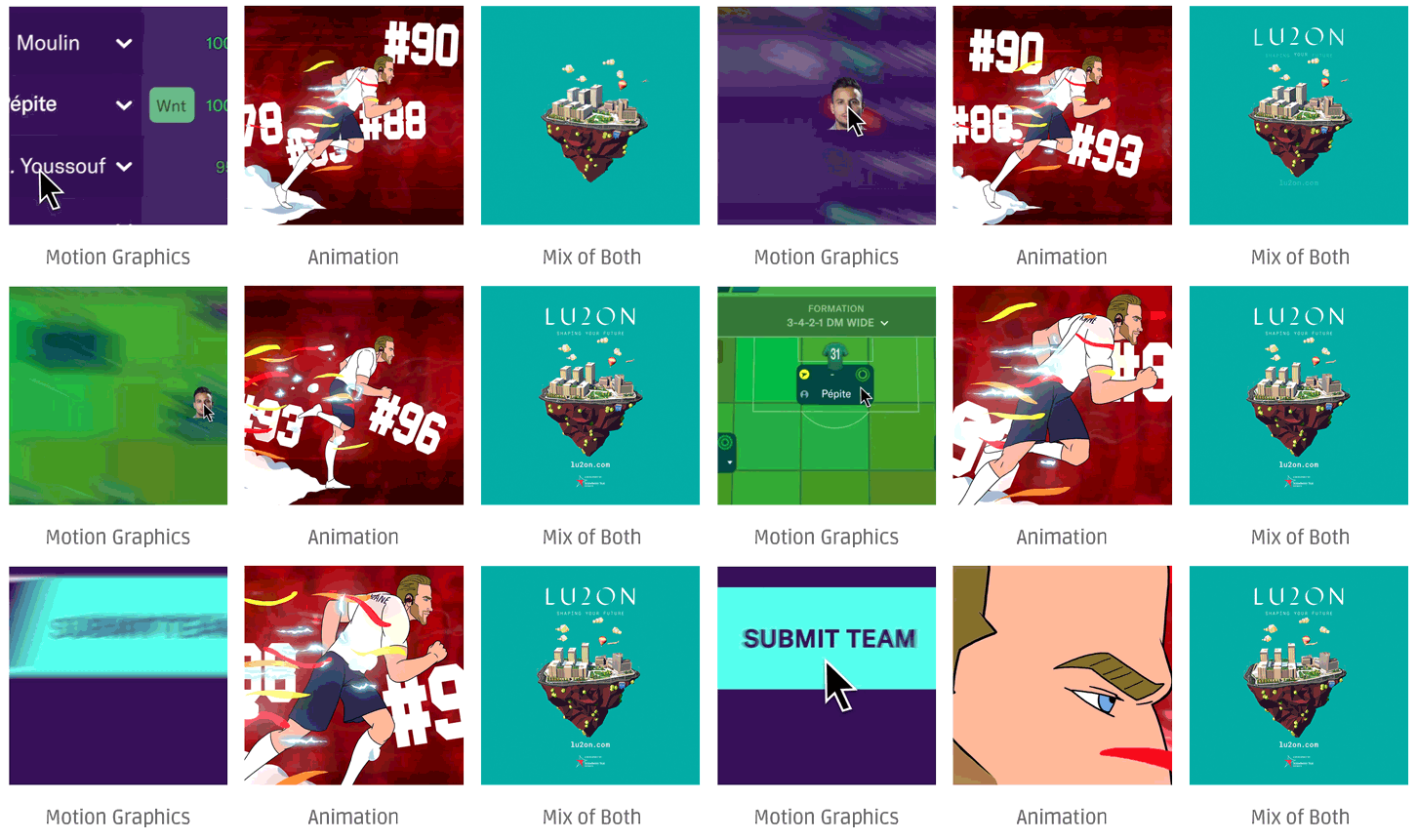
Motion Graphics vs Animation – What’s the difference and what should I use?
So what’s the difference? The short answer is “they’re kinda the same”.
Both exist under the umbrella of ‘animated content’ – however, there are some subtle differences.
Unless you work directly in the field of animation / motion you’re likely not sure how to tell the two apart, a bit like Jedward.
That’s why we’ve put together this post to help answer this ‘grey’ question.
Are Motion Graphics and Animation really that different?
To the untrained eye not that much. And the bottom line is: there’s so much crossover.
Visually, they are quite similar. Animated content of any form can be considered “animation”, but motion graphics is in a sub-section of its own.
Motion Graphics, as the name suggests, has its roots in graphic design. Imagine text and images coming to life. When a TV advert ends and the logo whizzes into the centre of the screen, we’re watching some classic motion graphics.
Animation, on the other hand, covers a much broader spectrum of content. Classically we think of cartoons and animated films, but the spectrum is wider than that. In all honesty, anything can be animated.
Case Study #1 – Motion Graphics – FM2020 Trailer
This is a good example of motion graphics. Have a look at all the elements used here, text and graphically designed elements. It’s all blocky colours & icons. Some might say quintessential motion work.
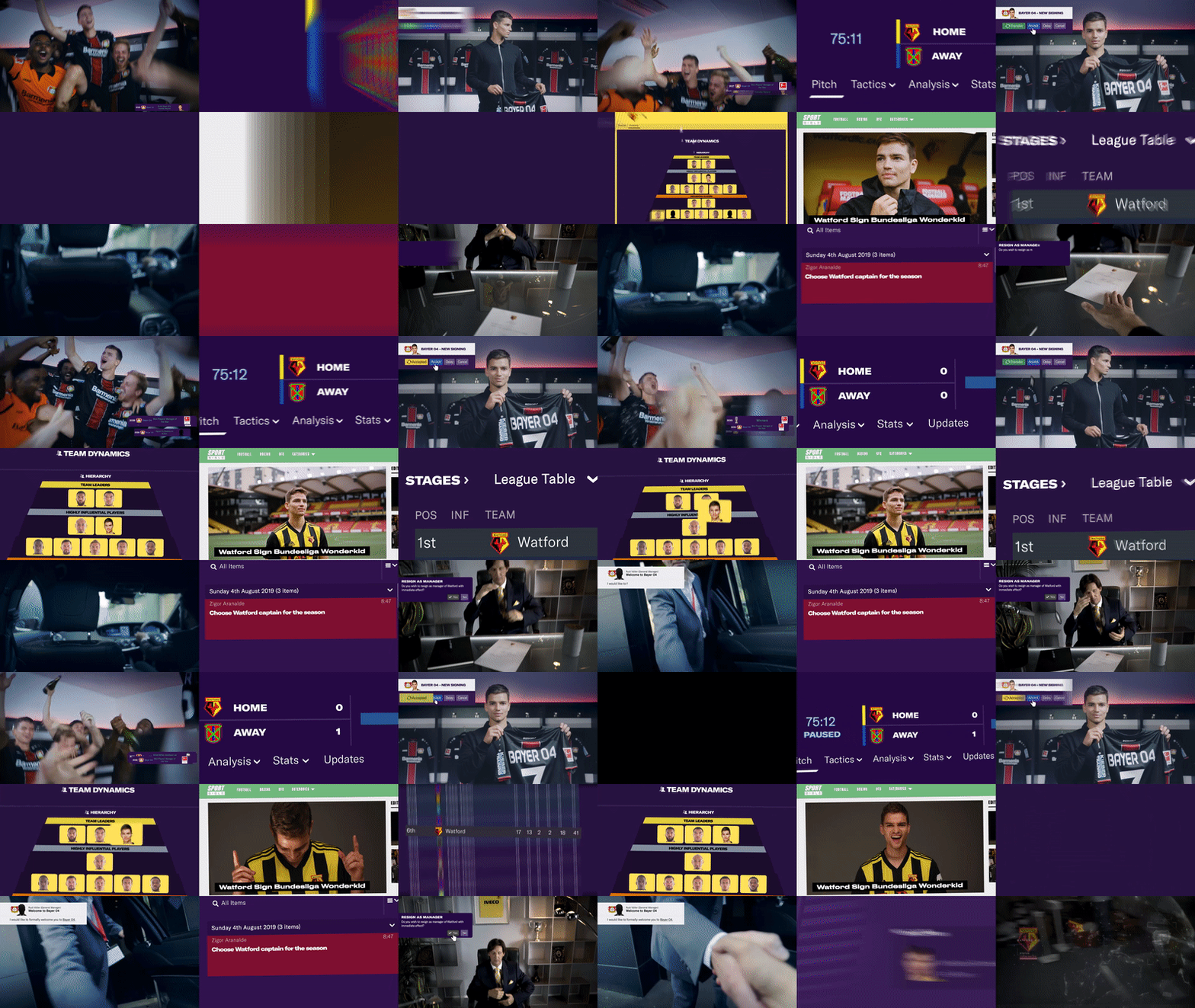
A typical workflow for this type of project is taking layers straight out of Adobe Illustrator and moving them around in After Effects.
The craft here is in the timing and rhythm of the movement of the objects. It’s also in the initial graphic design. Good motion design will be underpinned by good layout and graphic design techniques.

Graphic designers are always attempting to communicate with their viewer by creating a visual hierarchy. With motion design you have the added ability to move objects around the screen to draw attention to certain images or words or ideas.
Case Study #2 – Animation – Beats by Dre with Harry Kane
We’ve picked this out because it’s traditional frame by frame animation. Its drawn by hand. The human brain is doing the heavy lifting here in terms of making things look like they’re moving. This job was drawn in photoshop. Although this is a branded piece of work for Beats the focus here is on action and storyline.
The process for a piece like this starts with a storyboard.
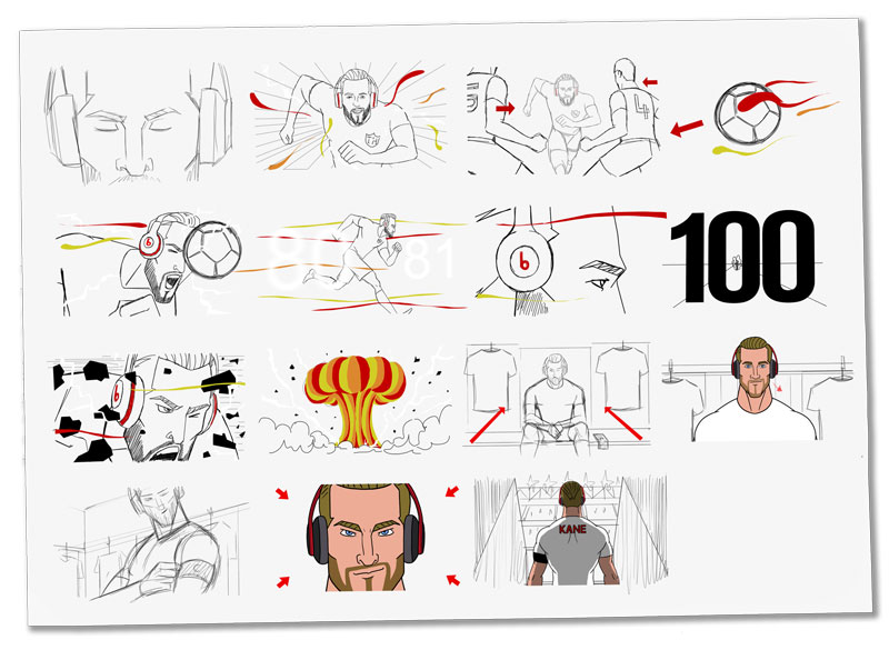
Then roughs are made of the main animated elements.
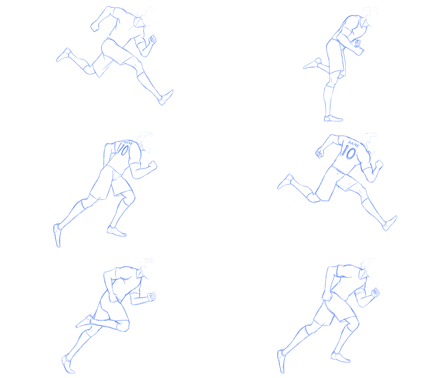
Then the final piece is put together with colour and neatly drawn lines.
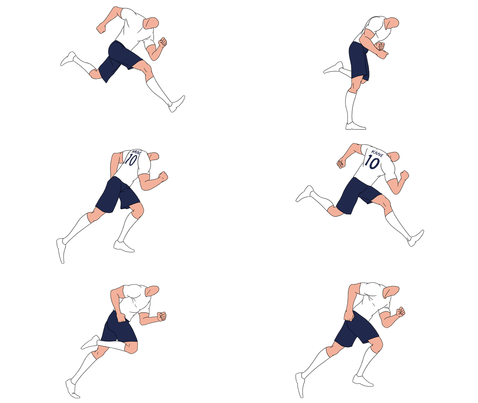
Starting to get a feel for this? Let’s move on.
Case Study #3 – Both together – LU2ON
This project falls somewhere in between the two disciplines. It probably leans more towards the animation side of things, but the style is very design led.
In fact, the client for this project is a graphic design agency and before we built the low poly island, they provided us with some key visuals (below) to work to.
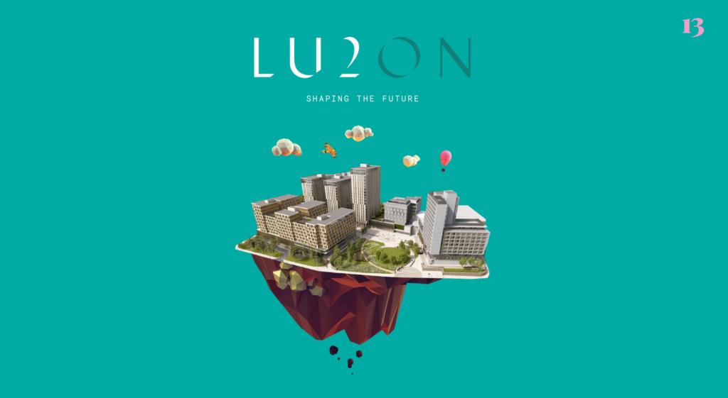
Spot the difference – this is the key visual we were sent which had been mocked up in Adobe Illustrator and Photoshop.
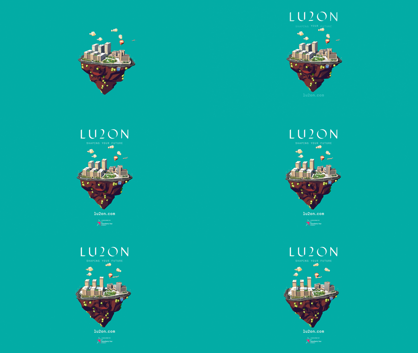
The end slate (below) is a classic mix of both the styles. The rotating island in the middle being the animation, and the logo and text appearing above and below being the motion graphics.
Still confused? Don’t know which to use?
There’s no right or wrong answer. You might end up needing a little bit of both. At the end of the day what’s needed is the right way to tell your story.
When applied in the correct way, both animation and motion graphics can tell a lasting, and memorable story in a way that simplifies complex ideas and information into easy-to-understand pieces.
If you have a main focal point in your production, such as a person, product or service, animation might be the best choice for you.
On the other hand, motion graphics is the go-to when it comes to painting the bigger picture. Developing a strong story and informing your target market with relevant facts, figures and data is usually the most compelling way to educate and develop a relationship with the viewer. And this, in turn, will help them engage with your message, whether they’re a shareholder, customer or investor.


